The Sawtooth That Never Stops: Charles David Keeling's Mauna Loa Curve (1958–Present)

Some of the most important climate images are not photographs at all. The Keeling Curve is a simple line of carbon dioxide measurements plotted month by month. It has no polar bears, no flames, and no flooded streets. Yet it may be the most consequential picture in environmental science: a steady, jagged climb that has never turned back down in nearly seven decades.
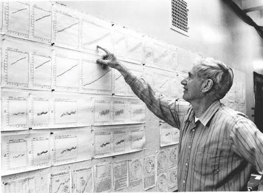
The story begins with one patient scientist. In 1958, Scripps scientist Charles David Keeling began monitoring CO2 concentrations at the NOAA weather station at the Mauna Loa Observatory, recording an initial measurement of 313 ppm on March 29 of that year. The site was chosen because it is remote. The observatory sits at roughly 3,400 meters on the island of Hawaii and is widely regarded as the global benchmark for monitoring atmospheric CO₂. At that altitude, far from cities and forests, the air reflects the well-mixed atmosphere rather than local pollution.
Keeling found two things, and both are visible in the curve's shape. The first is a yearly rhythm. Keeling was the first to recognize that CO2 levels in the Northern Hemisphere peaked in May, fell during the growing season, and rose again as plants died in the fall. Each small zigzag is the planet's vegetation inhaling and exhaling, like a breath taken by the whole Northern Hemisphere. The second finding is the underlying trend. Beyond the seasonal swings, Keeling recognized that CO2 concentrations were rising year after year. Together, these two patterns give the curve its sawtooth shape tilted upward. It is a living planet breathing inside an atmosphere that is steadily filling up.
The curve also teaches through persistence. Unlike a single dramatic photograph, its power comes from accumulation, and the record has survived real threats. When Mauna Loa erupted in November 2022, lava buried more than a mile of the observatory's access road. Scripps and NOAA moved measurements temporarily to the summit of nearby Maunakea, and in 2023 NOAA staff arrived by helicopter to install solar power and battery backup so measurements could resume at Mauna Loa. The work now continues across generations. Ralph Keeling, Charles's son, directs the Scripps CO2 Program. After the 2025 reading, he summed it up dryly: another year, another record.
That record keeps moving. Scripps reported a May 2026 peak of 432.00 ppm, up 1.8 ppm from 430.2 ppm in May 2025, while NOAA's Global Monitoring Laboratory reported 432.3 ppm. The UK Met Office has used the curve for forecasting, and its 2026 outlook warned that CO2 would keep rising too fast to track the IPCC's 1.5°C scenarios. In the years since Keeling's first measurement, concentrations have risen by roughly 120 ppm, and the pace of increase has accelerated.
So why does a graph move people? Part of the answer is that it is hard to argue with. A photograph can be framed, cropped, or accused of cherry-picking a moment. The Keeling Curve is the same measurement, taken the same way, in the same place, for 68 years. It also makes something invisible visible. No one can see carbon dioxide, but anyone can see a line that only goes up. Where a photograph like "Earthrise" made us see our home, the Keeling Curve made us see what we are putting into its air. As long as the sawtooth keeps climbing, it remains the most honest image in the climate conversation.


Comments